CSS Box Model - Understanding the Fundamentals
- Authors
- Name
- Muhammad Ahsan Ayaz
- @codewith_ahsan


- Posted on
- Posted on
CSS (Cascading Style Sheets) is a powerful web technology that allows web developers to add styling to their HTML documents. One of the most important concepts in CSS is the Box Model. The Box Model refers to the way that elements are rendered on a web page, and how their dimensions are calculated.
In this blog post, we will dive into the fundamentals of the CSS Box Model, including its components and how it affects the layout of web pages.
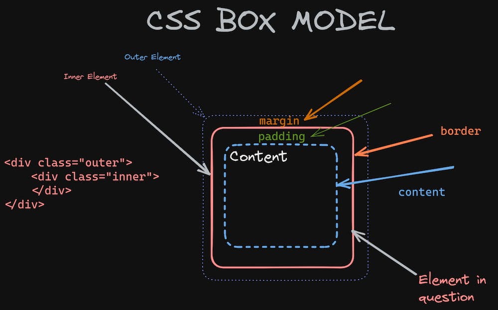
The Components of the CSS Box Model
The CSS Box Model is made up of four components:
- Content: This is the actual content of the element, such as text, images, or videos.
- Padding: This is the space between the content and the element's border.
- Border: This is the line that surrounds the content and padding of the element.
- Margin: This is the space between the border of the element and other elements on the web page.
All elements on a web page have a box model, even if it is not explicitly defined in CSS. By default, the box model includes only the content, without any padding, border, or margin.
How the CSS Box Model Affects Web Page Layout
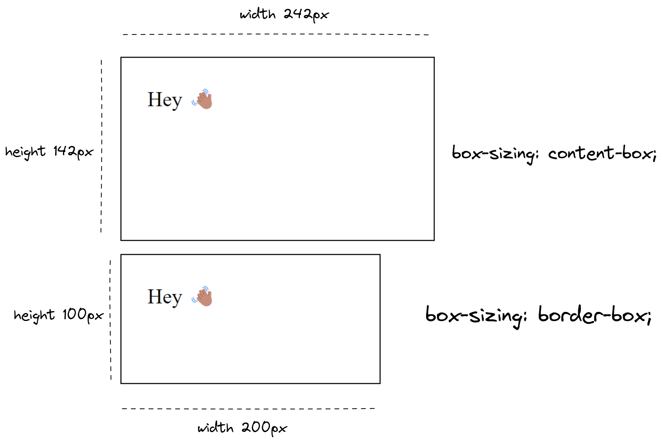
The CSS Box Model has a significant impact on the layout of web pages. For example, if you want to create a box with a certain width and height, you must take into account all four components of the Box Model.
Consider the following CSS code:
.box {
  width: 200px;
  height: 100px;
  padding: 20px;
  border: 1px solid black;
  margin: 10px;
}
This code creates a box with a width of 200 pixels, a height of 100 pixels, a padding of 20 pixels, a border of 1 pixel, and a margin of 10 pixels.
The total width of the box will be calculated as follows:
Total width = width + (2 x padding) + (2 x border)
Total width = 200 + (2 x 20) + (2 x 1)
Total width = 242 pixels
Similarly, the total height of the box will be calculated as follows:
Total height = height + (2 x padding) + (2 x border)
Total height = 100 + (2 x 20) + (2 x 1)
Total height = 142 pixels
As you can see, the total dimensions of the box are larger than the specified width and height due to the padding, border, and margin.
Box Sizing
In addition to the components and layout of the CSS Box Model, it's worth noting the impact of the box-sizing property. When set to border-box, the box-sizing property changes the way that the width and height of an element are calculated, including padding and border. This means that the total dimensions of the box will be equal to the specified width and height, without adding any extra space for padding, border, or margin.
Using box-sizing: border-box; can make it easier for developers to create consistent and predictable layouts, as it removes the need to manually adjust dimensions to account for padding and border. It's especially useful for creating responsive designs, as it allows elements to resize without disrupting the layout of the page.
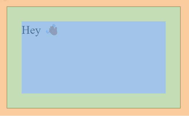
Example:
<!-- HTML -->
<div class="box">Hey 👋🏽</div>

<div class="box">Hey 👋🏽</div>
/* CSS */
.box {
  width: 200px;
  height: 100px;
  padding: 20px;
  border: 1px solid black;
  margin: 10px;
}

.box:nth-of-type(2) {
  box-sizing: border-box;
}
Conclusion
The CSS Box Model is a crucial concept in web development, and understanding its components and layout is essential for creating effective and aesthetically pleasing designs. Additionally, using the box-sizing: border-box property can make development easier by removing the need for manual adjustments to dimensions to account for padding and border. This property also facilitates responsive design by allowing elements to resize without disrupting the layout of the page. By mastering the CSS Box Model and leveraging box-sizing, web developers can create beautiful and functional web pages.